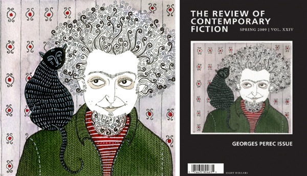
In May of 2010, I emailed Yelena Bryksenkova because I I knew that her Georges Perec watercolor for the cover of The Review of Contemporary Fiction would be a perfect gift for a favorite professor. Yelena, so kind and quick on the reply, relayed the bad news: my professor had already bought it. Of course he had. Yelena told me later, when I approached her for this interview, that the painting was an assignment for class, to draw an author she liked: “I did not know then that this illustration would come back to haunt me every few months for the rest of my life.” Since the moment I realized I’d been scooped by the intended recipient of my gift, I’ve read the books whose covers feature Yelena’s work, religiously stalked her blog, and populated whole worlds in my mind from the things her pens and paints create.
I asked Danielle Dutton, editor of Dorothy, a publishing project, and book designer at Dalkey Archive Press, how she discovered Yelena’s work: “I found Yelena in a very roundabout way… I was working on coming up with a cover for a special issue of the Press’s magazine The Review of Contemporary Fiction. This special issue was dedicated to the French writer Georges Perec, who happens to be one of my favorite writers, and so I set about trying to find something wonderful for the cover. Oddly enough, all I had to do was google “Georges Perec” and look at the images . . . on the first page was this funny, pretty, peculiar drawing of a famous photograph of Perec with a cat on his shoulder. I clicked on the image, found myself on Yelena’s blog page, and the rest went from there.”
Much of your work involves a response to a text (I’m thinking of your magazine work and your book covers for Dorothy, a publishing project). Yet your illustrations seem to exist independent of the text as well; they aren’t often dependent on a context. What’s your process for creating an illustration?
One of my favorite aspects of illustration is that it can be an aesthetically pleasing response to a text or idea and at the same time contain personal meaning, which the viewer isn’t under any pressure to find. Editorial illustration is intimidating to me because I have to convey the general idea in a clear and clever way, so I try to go with something light and charming, but without much depth. Illustrating a book cover is a bit different because it’s a chance to explore an atmosphere or an emotion that the story conveys. I had very specific art direction for the Comyns cover, for example, but I thought about the strangeness and darkness of the story as I worked on it, and that feeling (hopefully) comes through in the final illustration. This kind of work is more rewarding in the end, but it also often requires a great input of thought and emotion, which can be very painful and cause a great deal of restlessness on a day when the pencil just doesn’t agree with me. I think this is probably something writers can understand. The work of my favorite illustrators is often in response to a text, but the true value of those images is in the little secrets they hide, which gives them a quiet power and that important “stand-alone” quality. I see this ability to at once illuminate a given idea and also inspire emotions independent from it as the makings of an “ideal” illustration, and it is certainly something I strive toward.
Could talk a bit more about your editorial work—how you translate your response to a text into image?
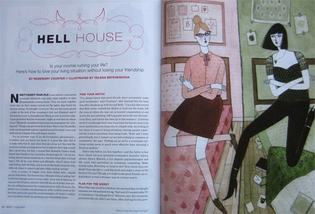
If the text has lots of imagery, I try to find the most striking image that can convey the main idea, and especially something that could potentially be humorous (I haven’t been hired to draw anything grim or depressing yet). In my “roomhate” illustration for BUST magazine, the object was to visually summarize the conflict described in the article, which is the tension between two very different people living in close quarters.
So I used contrasting colors, exaggerated body language, and an apparent difference in outfits and room tidiness to show it. I knew it wasn’t the most innovative idea, a little cliché even, but I felt like that was okay as long as the illustration was straightforward, fun, a little cheeky, and gave an idea of what the following article would be about. Speaking from my very limited experience, I feel that editorial illustration is about bringing to life the memory or mental picture that an item in a magazine conjures up for most readers – preferably in an interesting and aesthetically pleasing way.
A note from Danielle Dutton: “When I decided to start Dorothy, a publishing project, I knew I wanted to work with Yelena on the logo for the press. She’s talented and responsive and great to work with. Then when I got the rights to the Comyns book, again I knew Yelena would be perfect for that cover. I think there’s something very whimsical and earnest and smart about her work. I felt she and Dorothy would be a good match. Yelena also just did the cover art for a new book we have coming out this fall: In the Time of the Blue Ball by Manuela Draeger. And I hope we get to work together again.”
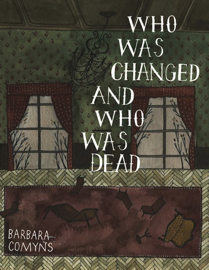
When you were illustrating Comyn’s book, Who Was Changed and Who Was Dead, what was it about the atmosphere that you wanted to convey? I’m wondering here if how the style, how the sentences work—even the book’s own logic, play a role in creating an image from its atmosphere. In your cover, there’s this stillness of the outside that we see through the windows, but everything inside is upended. Is there a connection here to lines we read in the book, like during the flood, when the hens commit suicide, sitting “on their eggs in a black broody dream until they were covered in water. They squarked a little; but that was all. For a few moments just their red combs were visible above the water, and then they disappeared.” There’s this bewildering thing that happens, but the language is so, not unimpressed necessarily, but kind of factual.
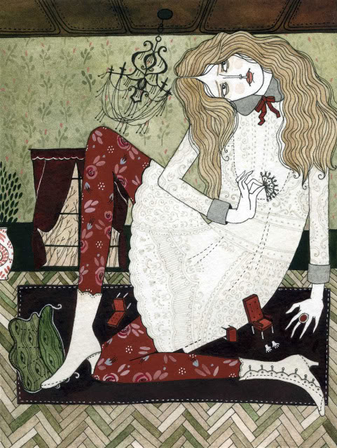
The story with the Comyns cover is that Danielle Dutton, the creator of Dorothy, a publishing project, and the person with whom I was working on the cover, gave me the following direction: to take my “Alice in Wonderland” illustration, and replace Alice with the hand-lettered title of the book. It’s essentially the same illustration!
So while the image wasn’t really born from Barbara Comyns’ words, it seemed to capture the feeling quite well. Of course this isn’t always the case, and I probably would have come up with something similar independently of the art direction. I like certain images of former glory, like once-beautiful houses wearing away, ghostly and bleak. I was also amused by the idea of drawing “a room where something just happened,” that doesn’t give away much beyond that. I don’t really draw action – most of my illustrations are like tableaux vivants – so my natural inclination to portray stillness paid off, because it’s that quality that makes the book so creepy and dark.
You said earlier that you like that illustration can be an “aesthetically pleasing response to a text.” As a writer intent on working with images, I’ve often struggled with the fact that when you put text and image together—one seems to always dominate the other. Either the text is king, and the images seem an afterthought, or the other way around. What do you think about this tension between text and image? (Or do you think it’s there at all?)?
Sometimes that tension can be stressful, like when I look at fashion magazines: I study all of the pictures and then read the text sort of compulsively – because I feel bad that it’s being neglected. Sometimes there is little tension, like in Lemony Snicket’s books where the illustrations are a pleasant, sometimes helpful embellishment but don’t scream for attention. In either case, like you said, either the image or the text is king. I find balance, or at least harmony, in a striking image with a little bit of text that just makes the image more meaningful. And the image returns the favor. For example, Maira Kalman’s illustrated sketchbooks, which inspired mine.
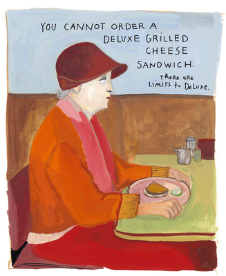
Each page of Principles of Uncertainty doesn’t say much but at the same time says everything. I like that the text is often part of the image, perhaps that’s what really strengthens the union.
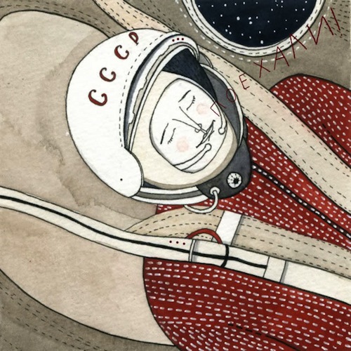
I have to ask you about your “portrait” of Yuri Gagarin.
I loved it when I first saw it, and then I went to his Wikipedia page and read that he whistled to himself on his re-entry to Earth. Reading “He whistled to himself” gave me such a shiver of joy, but to see his eyes closed in your painting, to see the peaceful look on his face, how relaxed he is, in juxtaposition to an outside knowledge, or least assumption, of the physical strenuousness of re-entry, adds this deep layer of appreciation to your painting. I mean, you manage to pull all this together in one image. How do you take a book, or an article, (or the world’s first manned space flight) and distill it into one image? I feel quite certain I would have a panic attack.
When I read about my subject, I mentally formulate a basic image, the final illustration, rather than think of specific points that I want to cover. With Yuri Gagarin, I just thought about him – his youthfulness, the loneliness of flying through the dark silence of space, the way he said “Let’s go!” at takeoff, his early death on a later test flight – and it became easy to draw because I was kind of recording my feelings about him. In the end, if somebody looks at it and can feel those things too, I don’t think, “mission accomplished” – instead, I’m just infinitely amazed. It’s a mystery to me too! There’s no formula; I’m just dealing with my overwhelming feelings for the subject. I’m very moved by beautiful things and when I was younger – before I had drawing as an outlet – I would just cry, with real pain and frustration, not knowing what to do with myself, whenever music, or art, or a book really moved me.
I think everyone wants to know an artist’s “origin” story—even if it can’t be adequately explained; if you could try, I’d love to hear about how you moved from “before I had drawing as an outlet” to now.
I didn’t show a particular interest in or patience for drawing until my junior year of high school, when I began going to a vocational program for commercial art; then it suddenly made sense for me to start applying to art colleges because it seemed that there was simply nothing else I could see myself doing. When I began studying at the Maryland Institute College of Art, I learned of illustration and it sounded like the perfect fit for me because I am at once dreamy and pragmatic, and I value the balance between craft and concept. I must have still been frustrated when I started out, because I distinctly remember being drunk and in tears because “Japanese girls are so beautiful” one night during my freshman year. I suppose I gradually began to learn how to “deal” with beauty. I keep sketchbooks for that now, to calmly compartmentalize it all instead of losing my mind from sensory overload.
When you were talking about the Yuri Gagarin image, you mentioned that you think of a “final” image over “specific points.” I was thinking a lot about this—about the whole over the part. Does this change the perspective you take? How do you choose whether the viewer is “zoomed in” (like the Yuri Gagarin—his face and the spacesuit that surround it take up the entire frame)?
Most of my formal decisions are intuitive, so I can’t say for sure when and why I do things a certain way, but I think that sometimes I might “zoom in” when I actually feel close to the subject. In a typical “lifestyle” illustration, I could show an entire room or outfit, and usually that’s me trying to push the boundaries of my abilities, learning how to “filter” something new through my style of drawing. But, when I woke up on Cosmonautics Day this year, I thought about our fella out there in space that day in 1961, and the warmth I felt toward him didn’t call for any complicated tribute. I drew the stitching on his shoulder straps, the tubes and protrusions of his suit, the complicated helmet, and his quiet, easygoing face, and I gave him that window with a view of outer space, too. Even if I made up most of them, I suppose those details are how I express my affection. Details are a good place to hide how I really feel, like secret notes to my future self, so I can remember later.
I was hoping you might share some examples of book covers you love and your thoughts on what a book cover should be.
I love and collect paperbacks that Edward Gorey designed when he worked for the Art Department at Doubleday Anchor in the late 1950s
as well as the current editions of his own work, now published lovingly by NYRB Classics are very handsome, especially Tove Jansson’s The True Deceiver and The Summer Book (with Jansson’s original illustrations on the covers).
I once bought the Russian edition of Banana Yoshimoto’s Amrita in Saint Petersburg because it had a clean design and a Yoshitomo Nara painting on the cover, but alas, the translation was lackluster. (On the contrary, the American editions, which are a lark to read, have pretty cheesy covers – so unfair!)
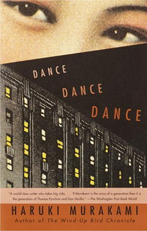
I love a book that has exceptional content and is itself and objet d’art that feels precious in my hands. The American paperback editions of Haruki Murakami’s books, in my opinion, strike the perfect balance between memorable prose and memorable cover art. John Gall designs them and even though they usually feature very static images of smiling girls from what looks like Chinese YueFenPai posters of the 1920s-30s, they seem to contain all of the melancholy and beauty of the story within. The cover of Dance, Dance, Dance is my favorite —the lit up hotel windows and those eyes represent to me inexpressible notions, things in my life that I fear and long for.
Dorothy, a publishing project, has just released their new book, Manuela Drager’s In the Time of the Blue Ball translated by Brian Evenson, and again, the book features your cover.
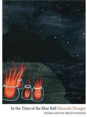
On your blog you mentioned that you had made smaller, interior illustrations for the stories, but they didn’t end up being included in the book. I think they are wonderful—they seem like they are from a very special encyclopedia. What do you do with them, now that they aren’t with the stories? Can I post them here and invite people to write stories “to” or “for” them?
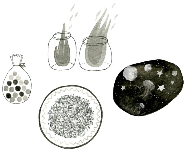
They are orphans for now; I would like for them to appear somewhere again one day, in a later illustration, because I quite like their strangeness. Especially the space debris and jellyfish, flying together in the chilly night. It would be lovely if someone could give them a home in a new story!
(Note from Jess: If you’re interested in (quickly) writing a story to one or more of Yelena’s interior illustrations for In the Time of the Blue Ball email them to me at jessicalstoner at, you know, gmail, and I’ll post them before my month here is up.)
+++
