Our Research Notes series invites authors to describe their process for a recent book, with “research” defined as broadly as they like. This time, Sara Lippmann writes about Lech from Tortoise Books.
+
Cover Outtakes

My novel ping pongs on vibes. Told from five different points of view, it’s about the potential sale of a property in the Catskills over the summer of 2014, but really, the plot is a dime store jar for a potpourri of obsession: predation, desire, faith, inherited trauma, motherhood, the circle jerk of life and death, the things we carry, and so on. Central to the story lies the biblical question of Lech, Lecha — How to go forth in life? Set it all against the backdrop of Sullivan County, NY, home to the former Borscht belt, now in the throes of change thanks to rural poverty, opioid addiction, climate change, tourist influx, etc., and you have a sense of the unapologetic, synthesis-resistant chaos.
Early trade reviews have grappled with the book’s emotional spectrum, calling it at turns, “bleak and brutal,” “charming” and “amiable,” and perhaps most accurately, “a jigsaw puzzle.”
Finding a cover that encapsulates its violent mood swings was no small task.
I wanted to play with attraction and repulsion. Lech, after all, sounds like you’re gonna hock something. I wanted to be confrontational. Funny but not too funny. I wanted it to feel regional, feel seasonal, yet off kilter, I wanted to evoke the past while grounding in the present, I wanted the heart and the ache, I wanted and wanted and wanted.
Catskills decay, I cried!
Thank goodness for Jerry Brennan. One of the best parts about working with a small press is the involved process of collaboration. Some presses have outside designers; Tortoise Books’ Brennan is a tireless, one-man operation. The dude’s an octopus. I don’t know how he does it all, but he does.
“Cover art’s tricky because it’s part art, part advertisement,” Brennan says. “And it’s always a collaborative effort – which, of course editing is, too, but here I think the roles are usually reversed and the publisher’s trying to produce something from nothing while the author gets to take shots. I imagine it’s like being in a band, with lots of talented people with egos and opinions, and everyone has to figure out when to speak up and when to listen. And, to totally mix metaphors, it’s also like parenting, where the author gives birth to a book and the publisher has to clothe it so it can survive in the cold cruel world.”
In January we started talking about artwork; we didn’t finalize a cover until late March. The intervening months contained countless emails and conversations, links to ideas, and image exchanges. Props to Brennan for managing to stay “alive to the emotion,” even as those emotions shifted over time.
+
1.Red Apple Rest: Could there be any riper symbol of Catskills rot? Here are the nostalgic remains of a bygone era, with its notes of alienation and decay, vestiges of predation, and an ironic nod to the real estate sale at the center of the book. For the past few summers, my family had been renting a cabin at Rosmarin’s, a much-loved bungalow colony in Orange County, NY, so we drove past the now-abandoned iconic rest stop on Route 17 each time we came and went. Once the gateway to the Catskills in its prime, Red Apple Rest features prominently in the film A Walk on the Moon, another touchstone for me. I was so convinced this would be it that I took a shot myself:
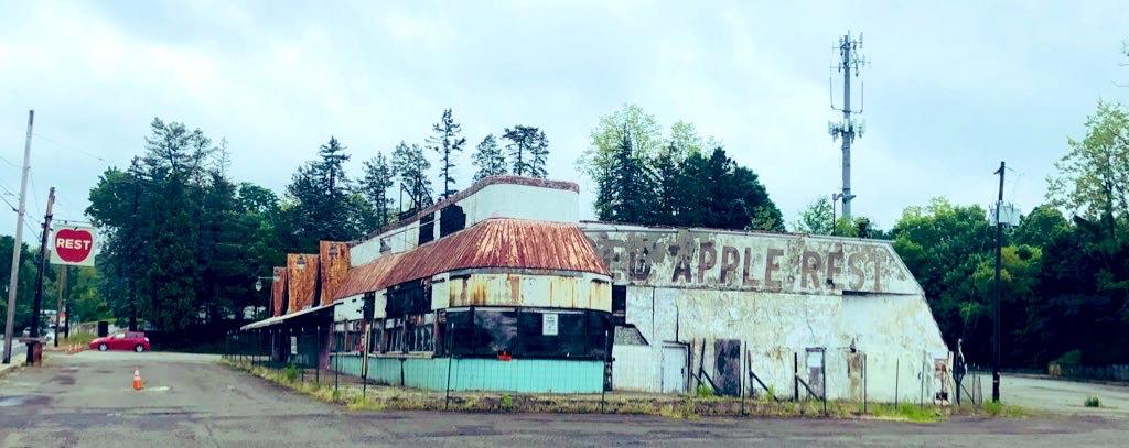
+
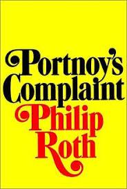
2. I also found myself feverishly hung up on Philip Roth’s iconic Vintage paperback covers. Obnoxious, perhaps, arrogant to place myself remotely in the same stratosphere, for sure, how dare I, but I felt like my book was obliquely responding to a lot of the tenets of the traditionally male Jewish canon on which I was raised, and I wanted to acknowledge the book’s forefathers while subverting them. I dunno. I thought it might be a ride.
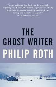
So, Jerry humored me with a sort of mash up. He found a wonderful photographer named Bob Skinner who had taken much better shots of Red Apple Rest than my shitty camera phone. Using Skinner’s work, Brennan offered up:
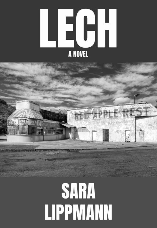
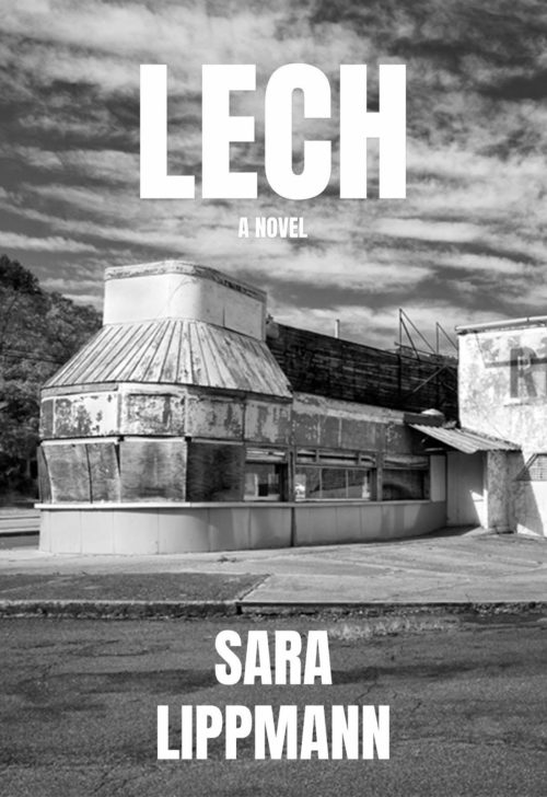
Which somehow made me think Western, as opposed to Catskills. Can you feel the tumbleweed? But I wasn’t yet ready to let go of the abandoned road stop, either, so Brennan tried it with color washes, softening the font to make it more humorous:


He also found another photographer named John P. O’Grady, who had captured a moody AF Red Apple Rest prior to its current state of utter abandonment. Talk about vibes:
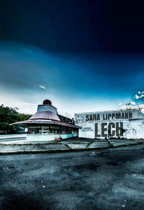
Still, something felt…off. Neither of us was getting a “Yes, this is it!” feeling. Brennan compares the decision to buying a house. “Sometimes you’re trying to rationalize it or talk yourself into it, and that’s no good.”
+
3. Because I’d been spending a lot of time in the region, I rummaged through my own photos. I also mined my husband’s archive for open fields, lakes, and old bridges. I liked the idea of a broken one lane like this one around Narrowsburg as it spoke to the central question of how to go forth from A to B in a ruined sort of way, but was it too pretty?

+
4. Borscht and Portnoy. Meanwhile, Jerry had another idea up his sleeve. This Borscht Belt curtain series serves up that predatory voyeurism with a healthy side of humor. It’s an ode to one of my characters, Ira Lecher, a lecherous, would-be comedian who never really got a shot at center stage. The ketchup and mustard color scheme made me think of a vomitous rug from the old Concord Hotel, but was it too… repulsive? Too funny? Had we lost the darkness? Jerry tried it in green, which gave it a grassier feel, but then a friend said it looked like a leprechaun and I couldn’t unsee it.
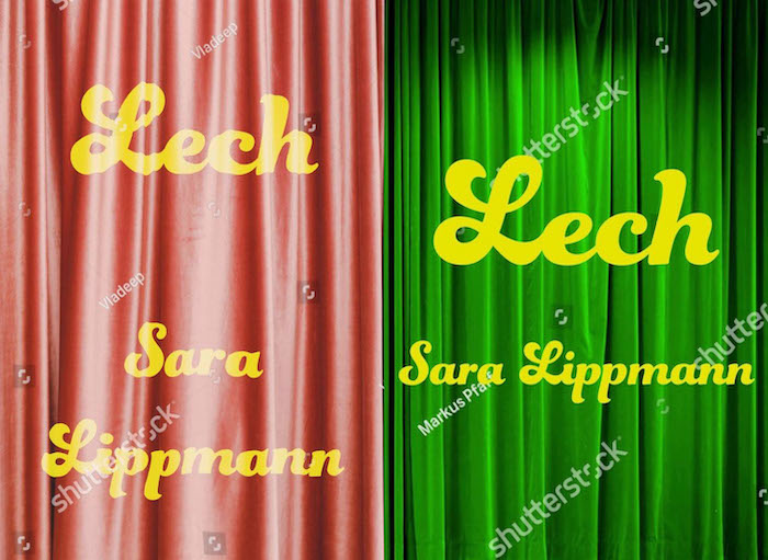
But God if I didn’t love the (very) distant nod to:
+
5. So we returned to the land of Catskills Decay. I’d long admired the wonderful photo exhibits of abandoned resorts. (An abandoned hotel makes a very brief, hallucinatory cameo.) I sent this image to Jerry, of Grossinger’s:

Which didn’t speak to him quite the way it spoke to me, but what it did was send him off in search of the perfect lawn chair.
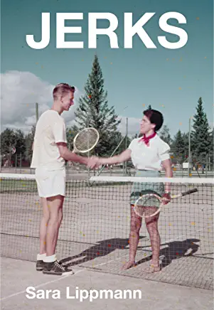
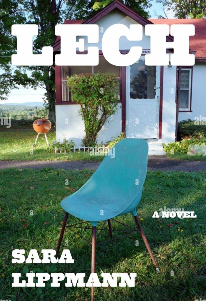
I liked this one a whole lot, as it also reminded me of the bungalow colony where I’d been going. (Ira rents out his house and camps out in a decrepit bungalow in my novel.) It felt quirky yet pleasing, a tad lonely but not creepy. Visually, it felt in conversation with my last collection, Jerks. The problem was licensing. The image was from Alamy, and we couldn’t find the owner, and we didn’t want to mess around.
+
6. Besides, where had all that predation gone? What had become of the dying animal? Had we lost our way? That’s when Jerry served up … THE FLY.
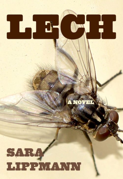
I died. This is it! I emailed him. I was in love. It was everything: funny, confrontational, creepy. Parasitism on full display. Even the shit brown font spoke to the absolute rot that permeates the book. I was sold. My husband howled. My sister said, “You can’t do that. It’s fucking gross.”
Which, I mean, I dumbly hadn’t considered. So, we reached out to my agent, Jenni Ferrari-Adler, for her take. She was diplomatic and ever wise. A bold choice, she agreed. But perhaps we had gone overboard on repulsion? Perhaps we had tipped the scales? “You want a cover to be welcoming, not offensive,” she counseled. “Would you pick up that book at the store?”
Which is how we arrived at:

My cover may not cover every theme, but hopefully it touches upon a handful. I love it for the nostalgia, the humor, but also the longing as the dinky chair stands alone. Most of all, I love it because it stokes a bit of curiosity as it invites the reader to come closer. Take a seat.
Brennan says, “In any art, you have to choose what to leave out; if you try to capture every flavor and nuance in a book you’ll end up with a mess. (If a picture truly is worth a thousand words, we’d be at seventy pictures or so, which would be a bad cover indeed!) It’s about evoking the spirit of the book, rather than encompassing it.”
I guess you’ll have to read the damn thing for the remaining vibes.
+++
| Sara Lippmann is the author of the novel Lech and the story collections Doll Palace, re-released by 7.13 Books, and Jerks from Mason Jar Press. Her work has been honored by the New York Foundation for the Arts, and has appeared in The Millions, The Washington Post, Best Small Fictions, Epiphany, Split Lip and elsewhere. |